
Creative strategy and brand identity for a small law firm known for punching above its weight and beating the big boys in the courtroom.
Intro
When David Swartz became a director at Phillip Silver and Associates, the firm renamed to Phillip Silver Swartz Inc. and used the opportunity to commission a new identity to match its reputation for out-thinking, out-fighting and out-lasting much bigger and flashier corporate law firms.
Exploration
Our initial research and interviews, with the partners at the firm as well as their clients, painted a picture of a team of extremely smart litigators with an enviable track record. They aren't afraid of a fight, and their peers note the thoroughness and hard work that goes into preparing for a case. They're the best lawyers around, but their identity failed to live up to their reputation.
The excellent results they achieve meant their existing clients didn't mind this, but the firm's appearance wasn't making the impression it should on potential new clients.
Strategy
Based on our research, we knew we wanted to emphasise the following points:
- Phillip Silver Swartz is the best litigation firm around. They're fearless in legal battles, beating much bigger opponents in and out of the courtroom.
- They fight tough, but also smart, taking advantage of their strengths and their opponents' weaknesses, and saving their clients both money and headaches with their insightful strategies and resourceful tactics.
- These strategies are born of a tireless work ethic and meticulous planning, covering every angle. Everyone on a case is expected to roll up their sleeves and put in the hard work necessary to ensure victory.
- All this results in a track record second to none. They keep winning, and so impressively that their defeated opponents come back as new clients.
We looked to combine these strengths with values the firm aspires to, addressing the shortcomings of the previous identity.

Execution
The logo's form was inspired by the intelligence the attorneys bring to their work, referencing problem-solving activities such as Rubik's cubes and labyrinths, as well as the strategic skills and forward thinking of chess, in which one of the directors, David, is an accomplished competitive player.
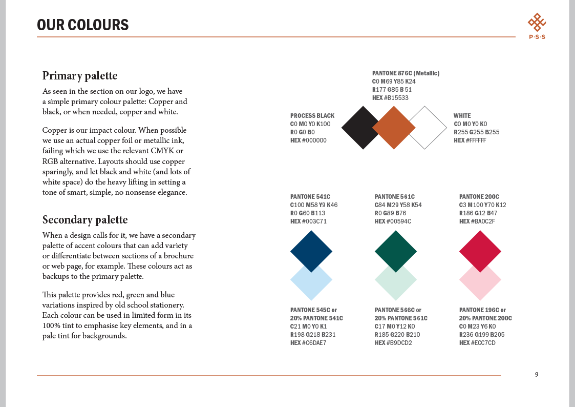
The firm's high calibre and impressive track record are reflected in the typography, for which we chose a classically formed serif typeface, making liberal use of its extended features throughout the identity's elements, as well as a metallic foil stamp on the business cards, for a smart, refined look.
The firm's new tagline is the simple, 'No problem.' and this down-to-earth simplicity is expressed by avoiding unnecessary embellishments and details. While their services are of the highest quality, these attorneys are ready to put in long shifts of hard work, which is reinforced by using copper, a more common working man's metal, for the foil, rather than a fancier gold or silver.


Finally, the firm's fighting credentials are referenced in the crest. Our initial discussions emphasised the importance the firm places on each attorney's respective skills and expertise, and the care they take in assigning exactly the right team with the right skill set to a case, so we personalised each attorney's business card with their 'weapon of choice' in the crest.