

I designed the identity and website for Shine's new incarnation as Rainbow as part of a strategic realignment. The new brand was launched at Mobile World Congress 2017, contributing to widespread media coverage in Bloomberg, Financial Times, and TechCrunch, among others.
Having previously built a powerful network-level ad blocker, Shine adapted its technology to provide ad verification services at the intersection between mobile networks, advertisers, publishers, and consumers.
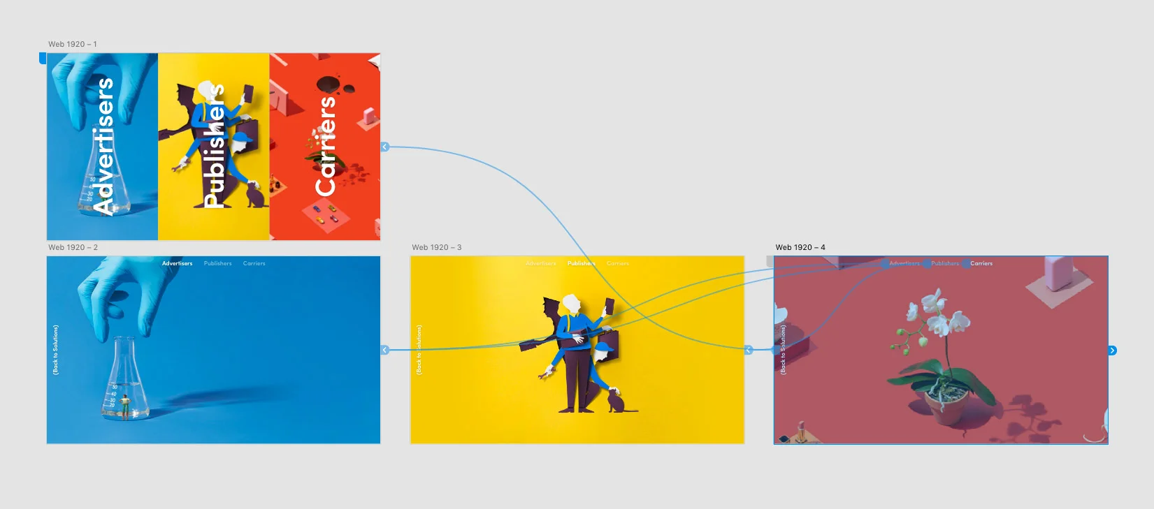
I worked on the brand identity for the new offering, Rainbow, including the website for both the B2B platform and the consumer-facing messaging.

Consumer-facing website

Platform website – Homepage

Platform website – Solutions for Publishers

Platform website – Contact form

Media Kit microsite
Our guiding principles in developing the new identity were:
- Light and colour – to exploit the obvious connotations evoked by our name.
- Optimism – about a better experience for all involved (consumers, publishers, advertisers, and ISPs).
- The golden age of advertising and editorial design — back when advertising was good.
- A different approach – the company's established reputation as 'different' set us apart from the well worn tactics and attitudes of other players in the Ad Tech market.


Business cards
Behind the scenes: Wireframing and UI exploration


Initial work focused on identifying our design principles, which guided the design patterns for both the website and, eventually, the product's interface.


Cycling between over-arching concepts (design principles and patterns), low fidelity thumbnails and scamps (wireframing/architecure), and more detailed mockups, enabled us to keep an eye on the big picture while getting a good feel for how the site and the product would actually look and work.

Wordmark development
The logo features a custom drawn wordmark. My starting point for the letterforms were the geometric sans-serif and neo-grotesk typefaces that are ubiquitous in tech start-up logos. A playful 'R-a' ligature, as well as adjustments to the stroke contrast and the letters' width, introduced a touch of humanism.


